System monitoring metrics
When logs and events pass through the TeskaLabs LogMan.io, the logs and events are processed by several TeskaLabs microservices as well as Apache Kafka, and most deployments store data in Elasticsearch. Since the microservices and other technologies handle a huge volume of events, it is not practical to monitor them with logs. Instead, metrics, or measurements, monitor the status and health of each microservice and other parts of your system.
You can access the metrics in Grafana and/or InfluxDB with preset or custom visualizations. Each metric for each microservice updates approximately once per minute.
Viewing metrics
To access system monitoring metrics, you can use Grafana and/or InfluxDB through the TeskaLabs LogMan.io web app Tools page.
Using Grafana to view metrics
Preset dashboards
We deploy TeskaLabs LogMan.io with a prepared set of monitoring and diagnostic dashboards - details and instructions for access here. These dashboards give you a broader overview of what's going on in your system. We recommend consulting these dashboards first if you don't know what specfic metrics you want to investigate.
Using Grafana's Explore tool
1. In Grafana, click the (menu) button, and go to Explore.
2. Set data source to InfluxDB.
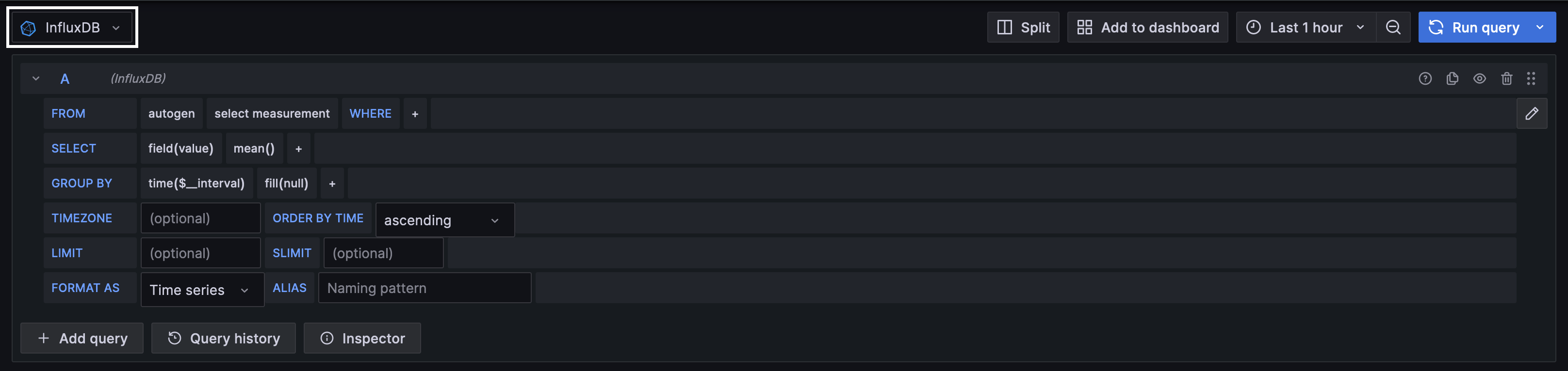
3. Use the clickable query builder:
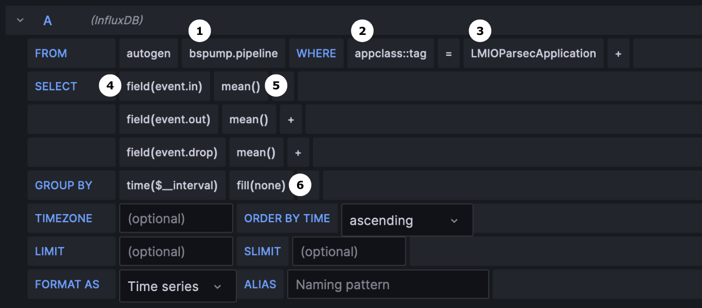
Grafana query builder
FROM:
1. Measurement: Click on select measurement to choose a group of metrics. In this case, the metrics group is bspump.pipeline.
2. Tag: Click the plus sign beside WHERE to select a tag. Since this example shows metrics from a microservice appclass::tag is selected.
3. Tag value: Click select tag value, and select a value. In this example, the query will show metrics from the Parsec microservice.
Optionally, you can add additional filters in the FROM section, such as pipeline and host.
SELECT:
4. Fields: Add fields to add specific metrics to the query.
5. Aggregation: You can choose the aggregation method for each metric. Be aware that Grafana cannot display a graph in which some values are aggregated and others are non-aggregated.
GROUP BY:
6. Fill: You can choose fill(null) or fill(none) to decide how to fill gaps between data points. fill(null) does not fill the gaps, so your resulting graph will be data points with space between. fill(none) connects data points with a line, so you can more easily see trends.
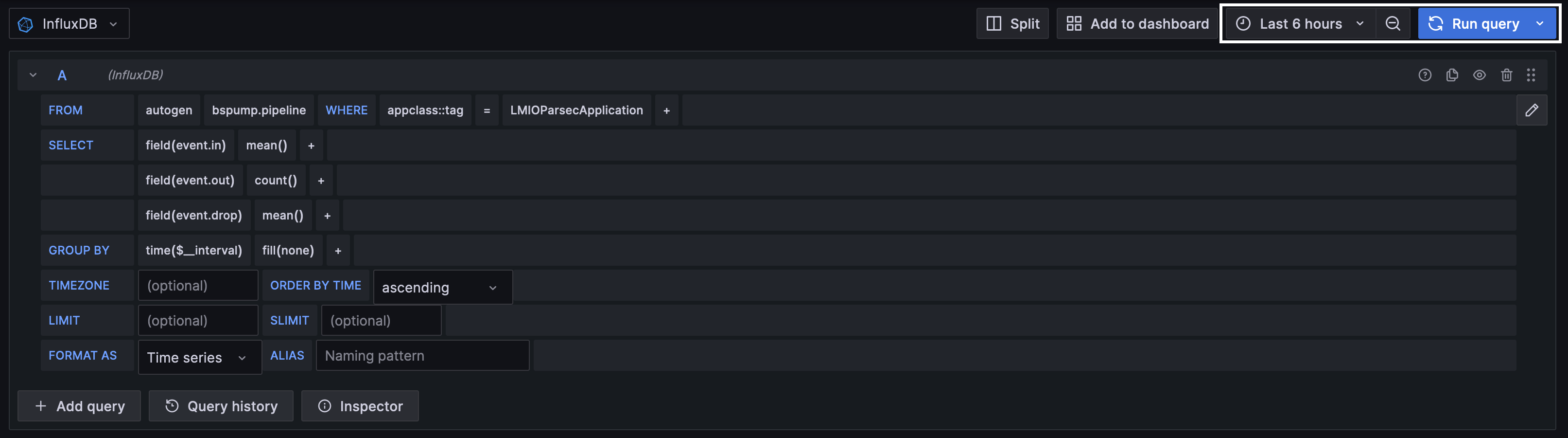
4. Adjust the timeframe as needed, and click Run query.
For more information about Grafana's Explore function, visit Grafana's documentation.
Using InfluxDB to view metrics
If you have access to InfluxDB, you can use it to explore data. InfluxDB provides a query builder that allows you to filter out which metrics you want to see, and get visualizations (graphs) of those metrics.
To access InfluxDB:
- In the LogMan.io web app, go to Tools.
- Click on InfluxDB, and log in.
Using the query builder:
This example guides you through investigating a metric that is specific to a microservice, such as a pipeline monitoring metric. If you're seeking a metric that does not involve a microservice, begin with the _measurement tag, then filter with additional relevant tags.
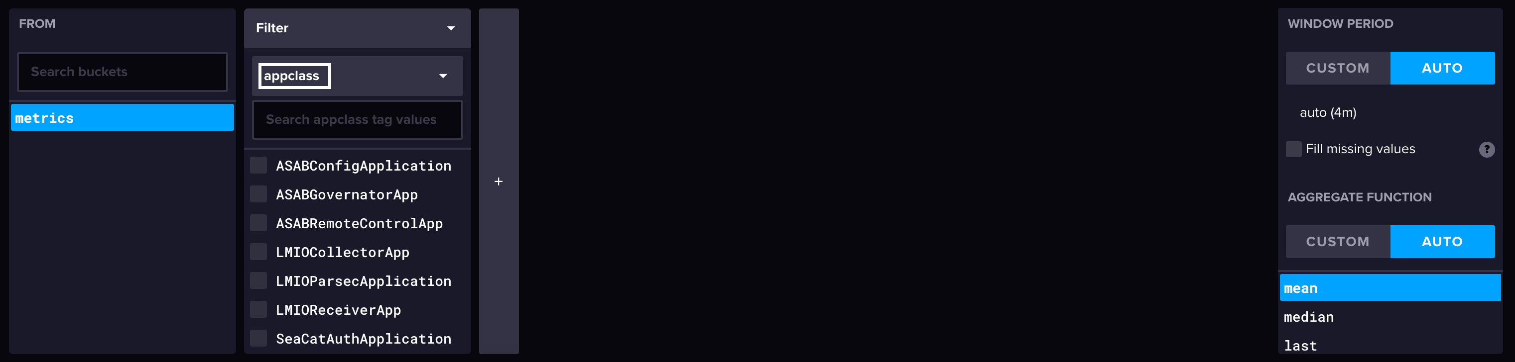
- In InfluxDB, in the left sidebar, click the icon to go to the Data Explorer. Now, you can see InfluxDB's visual query builder.
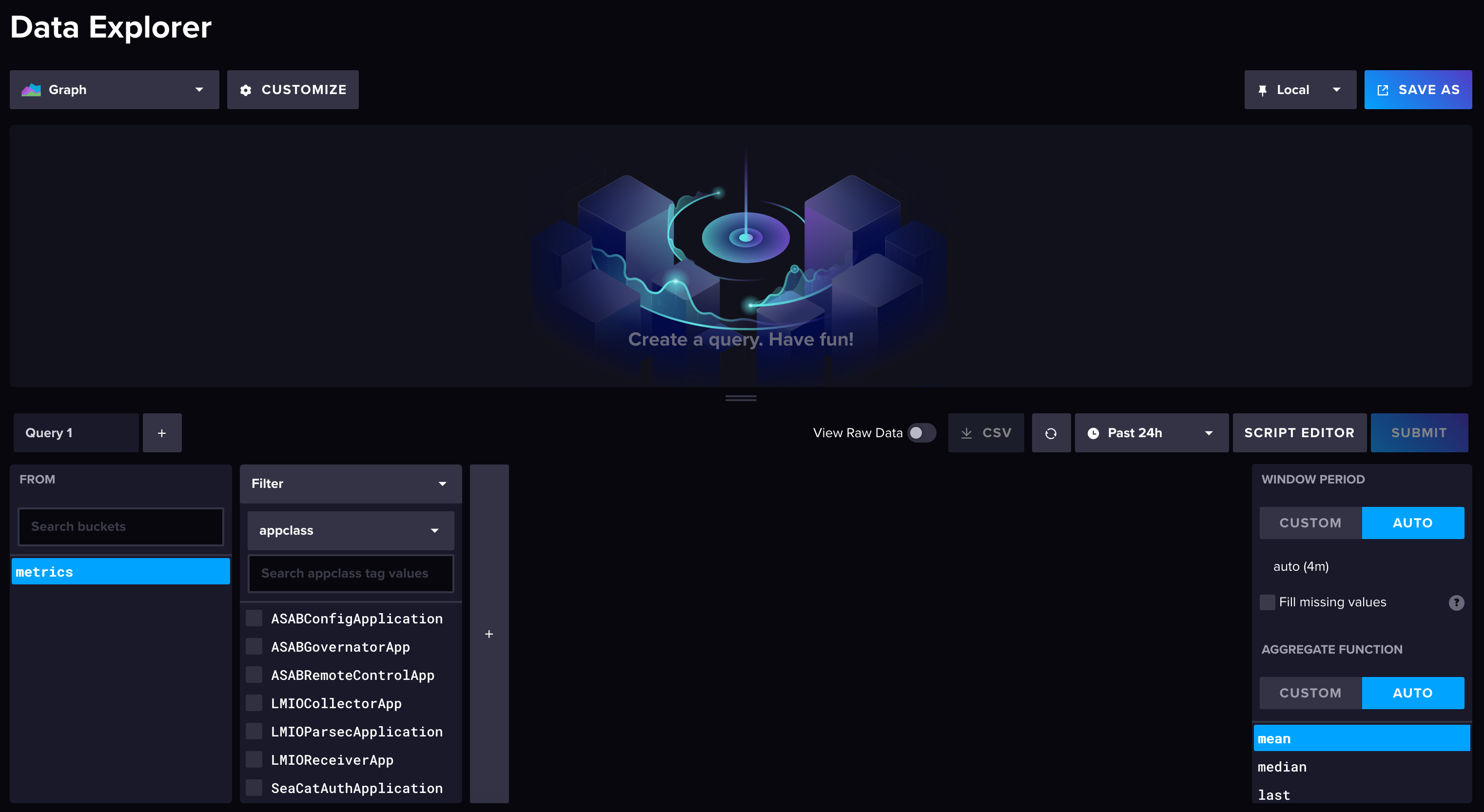
- In the first box, select a bucket. (Your metrics bucket is most likely either named
metricsor named after your organization.) - In the next filter, select appclass from the drop-down menu to see the list of microservices that produce metrics. Click on the microservice from which you want to see metrics.
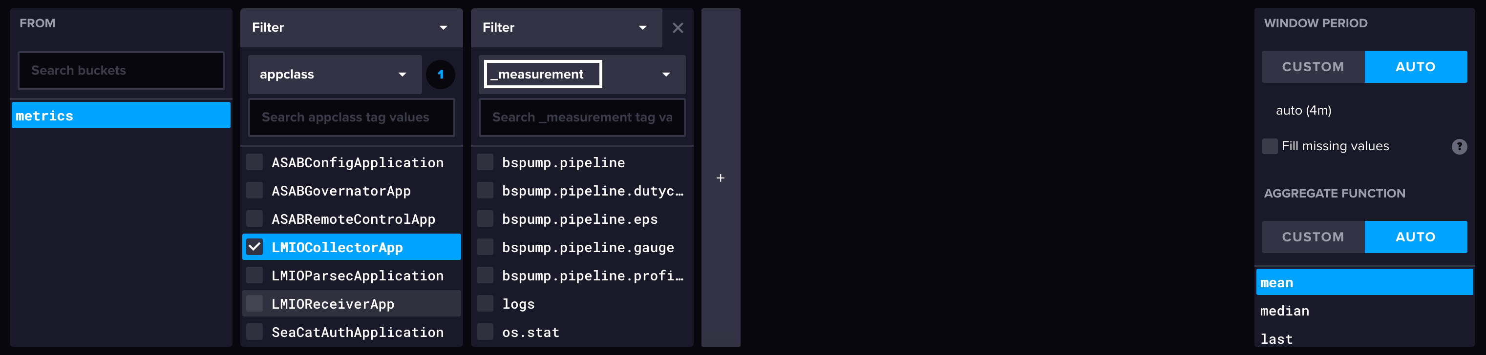
- In the next filter, select _measurement from the drop-down menu to see the list of metrics groups. Select the group you want to see.
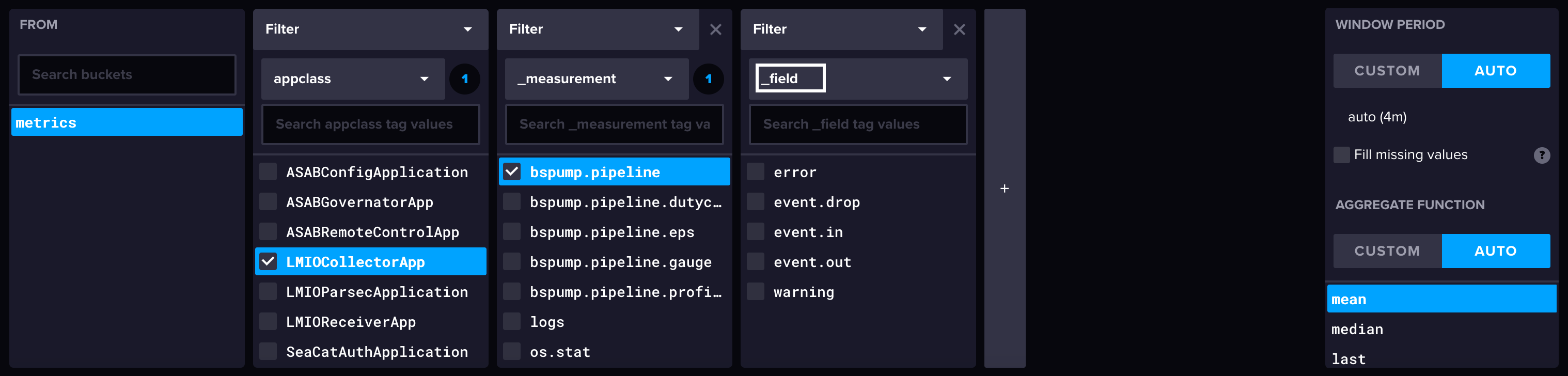
- In the next filter, select _field from the drop-down menu to see the list of metrics available. Select the metrics you want to see.
- A microservice can have multiple pipelines. To narrow your results to a specific pipeline, use an additional filter. Select pipeline from the drop-down menu, and select the pipeline(s) you want represented.
- Optionally, you can also select a host in the next filter. Without filtering, InfluxDB displays the data from all hosts available, but you likely have only one host. To select a host, choose host in the drop-down menu, and select a host.
- Change the timeframe if desired.
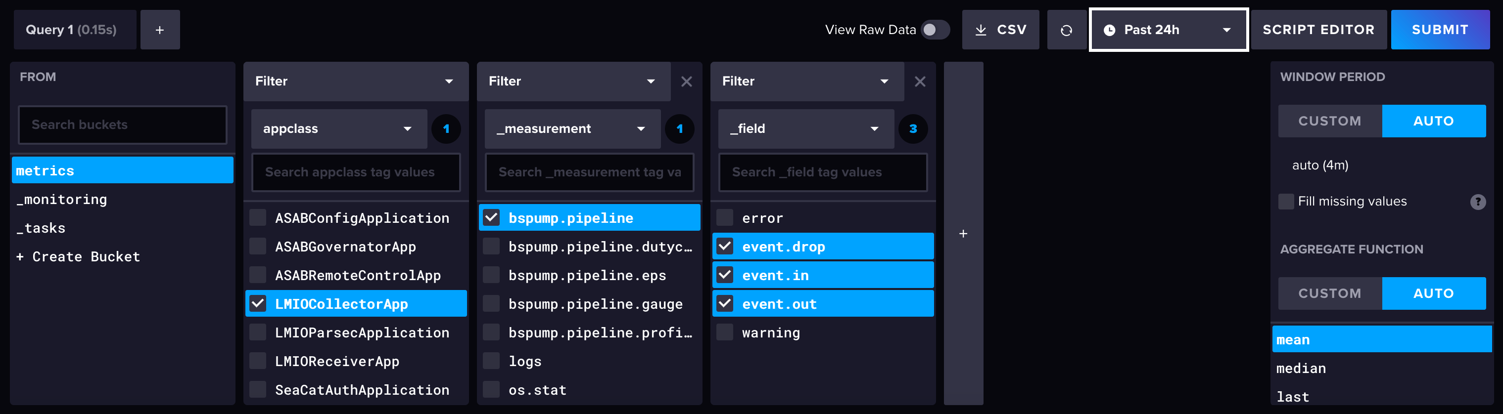
- To load the visualization, click Submit.
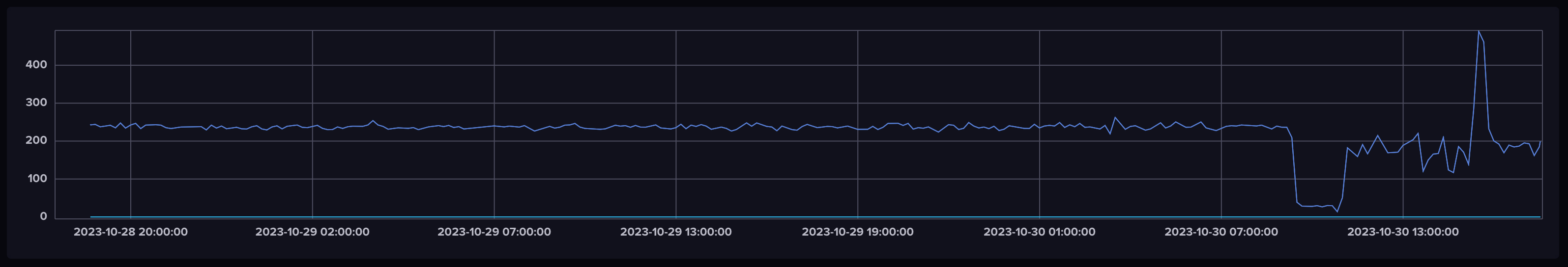
Visualization produced in this example:
For more information about InfluxDB's Data explorer function, visit InfluxDB's documentation.